


Nurture
Establishing the visual language for the nation’s first wellcare marketplace.
THE OPPORTUNITY
Nurture is a community-based wellcare marketplace focused on self care offerings for everyone. With over 60 vetted, independent beauty, wellness, fitness, cafe, and retail businesses, Nurture provides a place for our community members to meet all of their wellcare needs under one roof, and they needed a brand that represents just that.
THE SOLUTION
Nurture needed a brand that feels as human-centric as it does connected to nature. The colors, typography, layouts and brand elements were selected to help convey Nurture’s holistic and service-oriented offerings for all. With a largely female audience, and positioned as a location for wellness of all kinds, Nurture’s branding was rooted in themes of support, sacred geometry, golden ratios and the coalescence of nature and humanity.
Client: Nurture
Role: Visual Identity Design, Signage and Way Finding, Collateral Design, Illustration, Mural
In Collaboration with: Rebecca Reitz
Plants: Rooney Bloom
Photos: Luke Gottlieb & Nurture
Role: Visual Identity Design, Signage and Way Finding, Collateral Design, Illustration, Mural
In Collaboration with: Rebecca Reitz
Plants: Rooney Bloom
Photos: Luke Gottlieb & Nurture
View this full case study, and more, on our website.


The Visual Identity
THE WORDMARK
The strategy for the wordmark was rooted in the definition of the word nurture: “to care for and encourage the growth or development of.” We represented the “care and encouragement” through soft, approachable and nested letterforms (the “n” and “u” function as two arms cradling and holding each other.) To ensure the wordmark didn’t feel too feminine, we retained hard edges and corners on the serifs of the logotype.


THE LOGO
After exploring countless abstract and pictoral marks informed by nature, humanity, and sacred geometry, we landed on a very simple, clean solution.
The logo is inspired by the idea “at Nurture.” Nurture has positioned itself as a third place: home, work, Nurture. The mark represents a central community where all are welcome. It is modern, comforting, and memorable.


TYPOGRAPHY
Nurture’s brand typography utilizes the quirky semi-serif, Philosopher, a clean, bold Mr. Eaves, the versatile Acumin, and Beyond Infinity for expressive accents and callouts.
Philosopher’s letterforms nicely matched some of the nurturing qualities of our wordmark, while also having a plant-like quality. This typeface is distinct, and when set with the brand’s iconic emerald green, the style is instantly recognizable. Mr. Eaves offered an alternative, sans serif headline or subhead typeface, and Acumin is a diverse neo-grotesque typeface that offers a approachable text for digital body copy. Lastly, Beyond Infinity is a handwritten script that captures the human-centric essence of the brand.

PHOTOGRAPHY
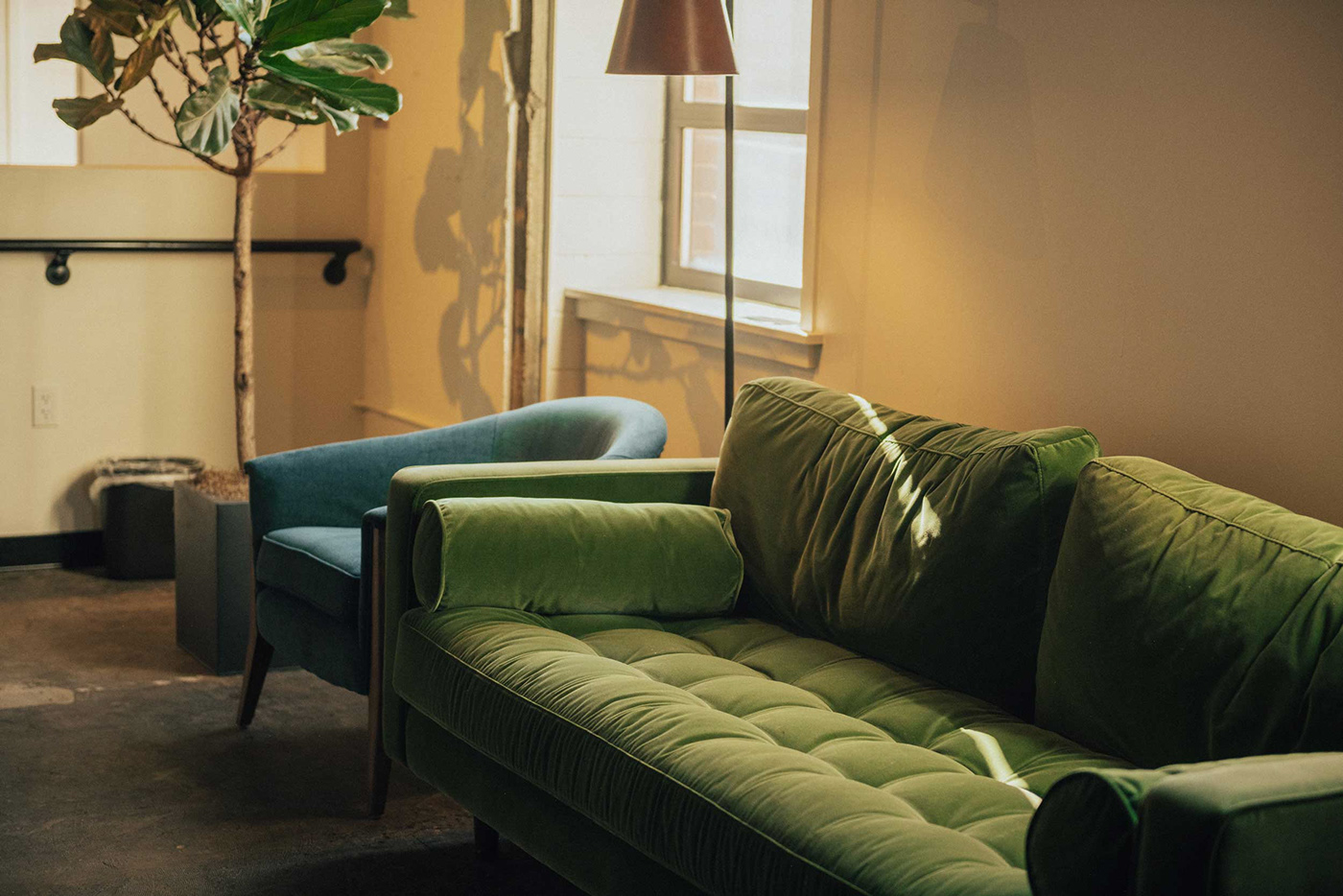
The bulk of Nurture’s photography needs fell into one of three categories: portraiture, food and bev, or environmental. A consistent thread through each of these categories was natural, soft lighting. Embracing the imperfections in us all, we suggested a wide range of natural lighting techniques can be embraced — from high to low contrast — allowing the humanity of the individual moment to inspire the final shot.
In the digital design application — particularly social media — treating the photography consistently enables the unification of the plethora of different businesses, service providers and messaging that Nurture has.


THE GRID SYSTEM
This golden ratio is an ideal ratio because of its lure to the human eye. Both the human skull and the human body dimensions follow the Golden Ratio, as seen in is Leonardo Da Vinci's drawing of the Vitruvian Man. These ratios are present in nature as well.
We systematized the layouts of marketing collateral with the Golden Ratio to aid in visual hierarchy of information.

Collateral Communications
Striking a balance between natural and premium, the design system uses floods of color, the brand typography, and photographic styles to create compelling compositions and easy-to-understand communications.


Member toolkit
With over 60 independent practitioners renting space within Nurture, and knowing that turnover was inevitable, there was a need for a single source of brand truth. The Member Toolkit captured the brand's mission, vision, values, copy examples, links to various social media templates, examples and assets that the businesses could use, or be inspired by. This document not only introduced the Nurture brand to the practitioners, but ensured everyone was presenting and speaking about Nurture correctly.

Subbrands
Using sacred geometry, a systematic and geometric repetition of natural elements as found in nature, as our basis for our sub-brands, a series of icons were created for the sub-brands. Each symbol’s container shape was that of the Nurture “at” symbol, and contained elements that spoke to the sub-brand itself.
All of these prints, and more, available for purchase in the Vicarel Studios shop.


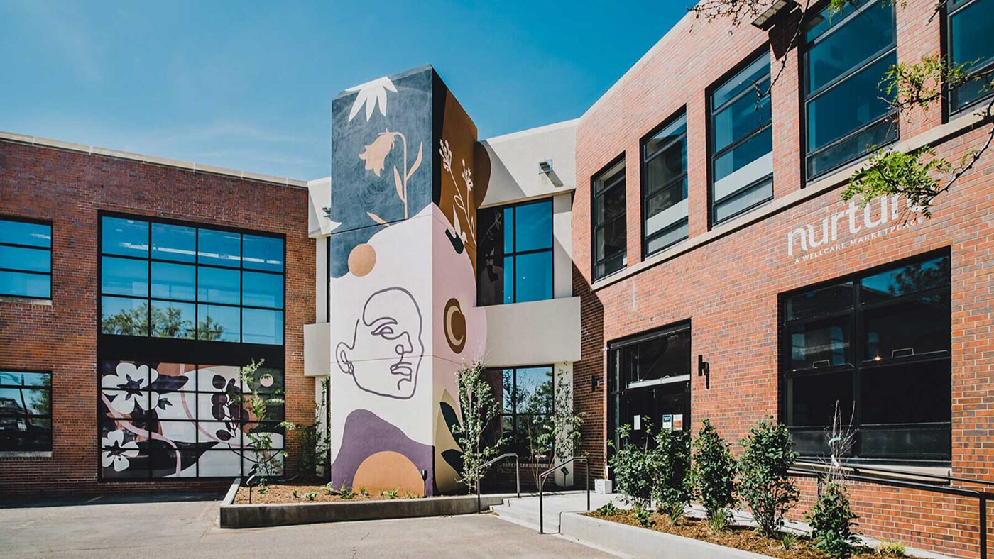
The Mural
We wanted the mural to help convey the Nurture brand to anyone who drives by. Combining simple illustrations that represent humanity and nature, as well as organic shapes, the beautiful jewel tones and face focal point immediately draw your attention to the building.
While these illustrations were created for the exterior mural that we painted, the style evolved and was repurposed as vinyl window graphics, the internal vinyl mural, and as assets to be used throughout the brand system and interior space.


Vinyl Mural & Interior Artwork
Greeting you as you enter the space is a vinyl mural showcasing the unity of humanity and nature. This continuous line illustration of ambiguous human faces and leaves, as a premium black on black color palette, with Nurture’s tagline, “Home for the Whole Human” as a signoff in the bottom corner.


In addition to this vinyl piece, we created a series of illustrative and photographic compilations to be hung as artwork throughout the space. Utilizing our previously established themes of nature-meets-humanity and sacred geometry, these art pieces function just as much as beautiful adornments as they do unifying visuals throughout the space.


Signage and Way Finding
Nuture is a sprawling two story, 23,000 sq. ft. facility. This space needed a clear way finding solution to help individuals navigate the space efficiently. We were tasked with creating two color-coded maps that were placed at each entrance as well as a series of directional placards that were placed at junctures and on pillars throughout the space. Clean vinyl naming was applied in brand fonts across individual practitioners’ doors, and large vinyl sub brands names were applied to pillars to help identify heavily visited areas of Nurture from afar.


